 352-639-5270


Discover the top responsive website design services that help improve user engagement and mobile conversion rates.
Responsive website design services are crucial in today's digital world, ensuring that your website looks great and functions well on any device, be it a smartphone, tablet, or desktop. These services not only improve your site's aesthetics but also improve user experience, leading to better engagement and higher conversion rates.
Here's what you should know:
- Responsive Design: Adapts website layouts to fit different screen sizes, ensuring consistency and usability.
- Mobile-First Strategy: Prioritizes mobile design first, then scales up for desktop, enhancing speed and navigation.
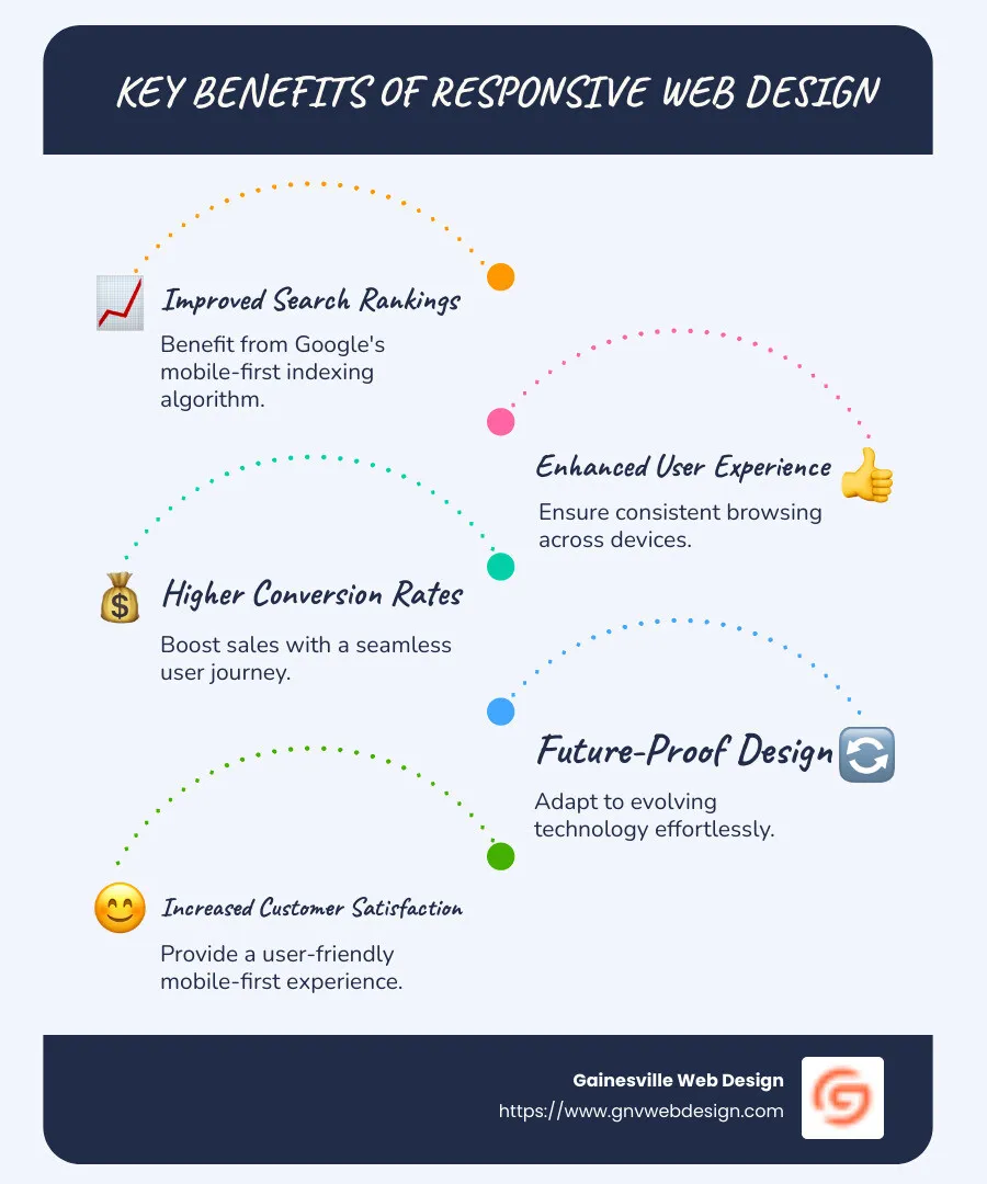
- Benefits Include:
- Improved search rankings due to Google’s mobile-first indexing.
- Increased customer satisfaction by offering a user-friendly browsing experience.
- Higher ROI through better conversion rates.
In an era where mobile browsing surpasses desktop usage, adopting a mobile-first strategy is not just beneficial but necessary. As Google's John Mueller highlights, if your website isn't optimized for mobile, you're "essentially asking customers to peer through a dusty window."
The flexibility of responsive design ensures your site is future-proofed against evolving technology. By implementing a mobile-first approach, your website will maintain seamless performance on any device, safeguarding future adaptability.
Understanding Responsive Website Design Services
Responsive website design services are all about making your website look great and work well on any device. This involves three key elements: fluid grids, media queries, and fluid images. Let's break these down:
Fluid Grids
Think of a fluid grid as a flexible layout that adapts to different screen sizes. Imagine your screen is a container divided into sections. These sections adjust their size as the screen size changes, ensuring everything fits perfectly. This flexibility is like having a magic puzzle that always fits together, no matter how you change the pieces.
- Why it matters: Fluid grids help maintain a consistent look and feel across devices, enhancing user experience.
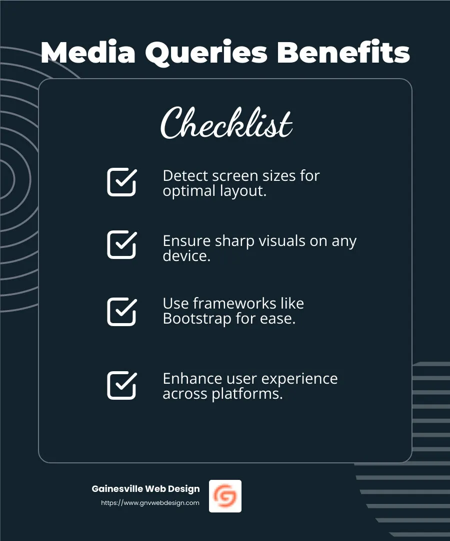
Media Queries
Media queries are like smart filters that detect your device's screen size and adjust the layout accordingly. They ensure that your website looks sharp whether you're on a desktop, tablet, or smartphone.
- Tools and frameworks: Using frameworks like Bootstrap can simplify the process by providing pre-designed grid systems and UI components.
Fluid Images
Images can be tricky because they don't naturally adjust to different screen sizes. Responsive web design uses CSS and HTML commands to make images flexible. This way, they resize automatically, avoiding awkward zooming or scrolling.
- How it works: HTML5 tools like
srcsetandpictureelements allow you to serve different image sizes based on the device, improving load times and performance.

Responsive website design services ensure your site is accessible and engaging, no matter how users access it. With fluid grids, media queries, and fluid images, your website will provide a seamless experience across all devices, enhancing both user satisfaction and business success.
Advantages of Responsive Web Design
Responsive website design services offer several key advantages that can significantly impact your online presence. Let's explore the main benefits: mobile conversion, user engagement, and SEO benefits.
Mobile Conversion
More than half of website traffic comes from mobile devices. If your site isn't mobile-friendly, you're likely missing out on a huge chunk of potential customers. Responsive web design ensures that your site adapts seamlessly to any device, boosting mobile conversions.
- Case Study: A notable eCommerce website saw a 30% increase in mobile traffic and a 20% boost in conversion rates after adopting a responsive design. This shift is like finding a golden ticket—more visitors and more sales!
User Engagement
A responsive website doesn't just look good; it keeps users engaged. When your site adjusts smoothly to different screen sizes, users can steer without frustration. This leads to longer visits and more interaction with your content.
- Fact: 85% of users want a mobile experience as good as a desktop one. A responsive design meets this demand by ensuring a consistent user experience across all devices.
SEO Benefits
Search engines, like Google, prioritize responsive websites. This means a responsive design can improve your site's search engine ranking, making it easier for potential customers to find you.
- Quote: "In the digital landscape, having a responsive website isn’t just a luxury—it's a necessity." — Neil Patel, Digital Marketing Expert
Why it matters: Google uses mobile-first indexing, meaning the mobile version of your site is what gets indexed. A responsive design ensures your site ranks well, no matter the device.
In summary, responsive web design services are essential for increasing mobile conversions, enhancing user engagement, and boosting your SEO efforts. With these advantages, your website becomes a powerful tool for attracting and retaining customers.
Top Responsive Website Design Services
When it comes to responsive website design services, not all solutions are created equal. Let's explore the top services that offer custom solutions, seamless experiences, and scalable designs.
Custom Solutions
Custom solutions are like a custom suit for your website. They fit your specific needs perfectly. These services start by understanding your business goals and audience. Then, they create a unique design that reflects your brand.
- Example: A local bakery in Gainesville used a custom responsive design to showcase its menu and specials. This personalized approach helped them stand out and attract more local customers.
Why it matters: Custom solutions ensure that your website isn't just another cookie-cutter template. It becomes a reflection of your brand's identity and values.
Seamless Experiences
Seamless experiences mean that users can move effortlessly through your website, no matter what device they're using. This is crucial for keeping visitors engaged and reducing bounce rates.
- Fact: Websites that provide a seamless user experience see a 70% increase in user engagement. This is because users are more likely to stay on a site that is easy to steer and visually appealing.
How it's done: By using techniques like fluid grids and media queries, responsive design services ensure that your site looks great and functions well on any screen size.
Scalable Designs
Scalable designs are built to grow with your business. As your needs change, your website can adapt without requiring a complete overhaul. This flexibility is invaluable for businesses planning to expand or add new features.
- Case Study: A tech startup in Tampa Bay used scalable design to add new products and services as they grew. This adaptability saved them time and money in the long run.
The benefit: With a scalable design, your website remains efficient and effective, even as your business evolves.
In conclusion, the top responsive website design services offer custom solutions, seamless experiences, and scalable designs. These elements ensure your website is not only beautiful but also functional and future-proof.
Frequently Asked Questions about Responsive Website Design Services
How much does responsive web design cost?
The cost of responsive website design services can vary widely based on your needs. On average, prices range from $3,000 to $25,000. Factors influencing cost include the complexity of your site, additional features like ecommerce, and the level of customization required.
- For example: A simple blog might cost on the lower end, while a complex ecommerce site with custom features could be on the higher end.
Investing in responsive design can save money in the long run. A single responsive site eliminates the need for separate mobile and desktop versions, reducing maintenance costs by up to 50%.
What is responsive web design?
Responsive web design uses fluid grids, media queries, and fluid images to ensure your website looks great on any device.
-
Fluid Grids: Think of your website layout as a grid that adjusts to fit any screen size. This ensures content is always displayed correctly.
-
Media Queries: These are like filters that help your site adapt to different screen widths and heights. They change the page layout to suit the device being used.
-
Fluid Images: Unlike text, images don't naturally adjust to screen sizes. By applying specific CSS/HTML commands, images can become "fluid," resizing automatically to fit the screen.
This design approach ensures a consistent and enjoyable user experience across all devices, which is crucial as more than 54% of global web traffic comes from mobile devices.
How do I make my website 100% responsive?
Making your website fully responsive involves following best practices and possibly embracing a mobile-first approach. Here's how:
-
Start with Mobile: Design for the smallest screen first, then scale up. This ensures your site is functional on mobile devices, which are the most challenging.
-
Use Fluid Grids: Ensure your layout can adapt to any screen size by using a fluid grid system. This allows elements to resize and rearrange themselves.
-
Implement Media Queries: Customize your CSS to use media queries. This ensures your site adapts to different screen sizes and orientations.
-
Optimize Images: Use responsive images that adjust to various screen sizes, ensuring they load quickly without sacrificing quality.
-
Test on Real Devices: Always test your site on multiple devices to ensure it looks and functions as intended.
By following these steps, you'll ensure your website is not only responsive but also future-proof, ready to handle new devices and screen sizes as they emerge.
Conclusion
At GNV Web Design, we pride ourselves on delivering responsive website design services that focus on quality and customer satisfaction. Our team understands that a responsive site is crucial for businesses aiming to succeed in today's digital landscape. With more than half of all web traffic coming from mobile devices, having a site that adapts seamlessly to any screen size is no longer optional—it's essential.
Quality is at the heart of what we do. We specialize in creating fast, visually appealing websites that are not only SEO-friendly but also designed to keep visitors engaged. Our custom solutions ensure that your site is custom to meet your specific needs, whether you're a small business or a large enterprise.
Customer satisfaction is our top priority. We offer comprehensive support from concept to launch and beyond. With services like unlimited edits, hosting, and Google Analytics, we make sure your site remains up-to-date and fully functional. Our clients appreciate our commitment to their success, and we work hard to ensure they have a hassle-free online presence.
By choosing GNV Web Design, you invest in a partner committed to your long-term success. Our responsive web design services are designed to improve user engagement, increase conversions, and boost your overall ROI.
Ready to lift your online presence? Explore our services and see how we can help your business thrive.