 352-639-5270


What is SEO-Friendly Web Design?
SEO-friendly web design is a harmonious blend of aesthetics and functionality, ensuring that websites are both visually appealing and easily findable by search engines. This involves integrating SEO best practices into the core design process, allowing for seamless user experiences alongside technical optimization.
The essence of SEO-friendly web design lies in making your website as attractive to search engines as it is to your visitors. It's about ensuring that every element, from content to code, is optimized to improve visibility. As famously put, "A beautiful website gains you nothing if no one can find it."
Key Elements of SEO-Friendly Web Design
Creating an SEO-friendly web design is more than just making your site look pretty—it means carefully considering certain key elements that make your website easy for both people and search engines to use. While there's no magic formula, there are important areas you definitely shouldn't overlook. From how quickly your pages load to how easy it is for Google to explore your site, let's dive into these essential areas one by one.
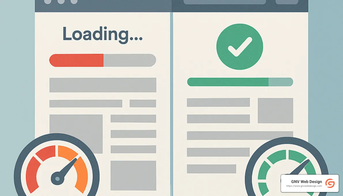
Website Speed and Performance
Nobody likes waiting around for a slow website—and that includes Google! Your website’s speed directly impacts both user experience and search rankings. Studies by Google have confirmed that page load times influence how well your site ranks in search results. A fast site reduces bounce rates, keeping users happy and engaged.
You can improve website speed by optimizing images, shrinking your CSS and JavaScript files, and using browser caching. Tools like Google’s PageSpeed Insights help you find areas for improvement.
Want to dive deeper into why speed matters? Check out Scientific research on page speed as a ranking factor.
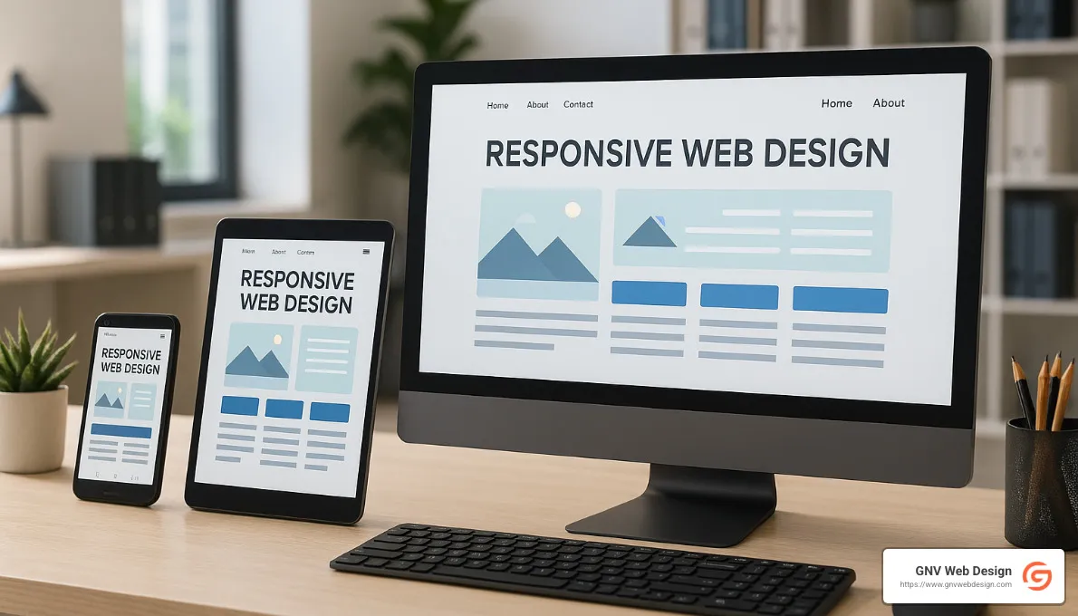
Mobile-First Design in SEO-Friendly Web Design
It's a mobile world out there! Well over half of all searches now happen on mobile devices, which is why Google has adopted mobile-first indexing. This means Google primarily looks at your website's mobile version to evaluate and rank your pages.
To stay ahead, adopt responsive design principles—ensuring your website adjusts seamlessly across phones, tablets, and desktop screens. This adaptability improves user experience and increases your chances of ranking high in search results.
Site Architecture and URL Structure
Think of your website as a carefully organized library. Clear and logical site architecture helps both visitors and search engines easily find content. Create a logical hierarchy where pages are grouped by topics or categories. Incorporate clean, human-readable URLs, and add breadcrumb navigation to show users exactly where they are on your website. These steps significantly help search engines to crawl and index your site efficiently.
Navigation and Internal Linking in SEO-Friendly Web Design
A user-friendly navigation system makes visitors happy, guiding them smoothly from one page to another. Thoughtful internal linking supports this by clearly connecting related pages within your site.
Internal links not only improve user experience—they also help Google understand your content's structure, topical relevance, and value. As Google's John Mueller once said, "Linking to other websites is a great way to provide value to your users." The same applies to linking internally—it's a win-win for both users and SEO!
Content Optimization Strategies
Content is king (or queen!), especially in SEO-friendly web design. Effective content optimization starts with thorough keyword research. Use keyword-driven headings, meta tags, and structured content that answers users' questions and meets their needs.
Quality content matters—focus on being genuinely helpful and informative. Proper content formatting, like clear headings and short, engaging paragraphs, also boosts readability and user satisfaction.
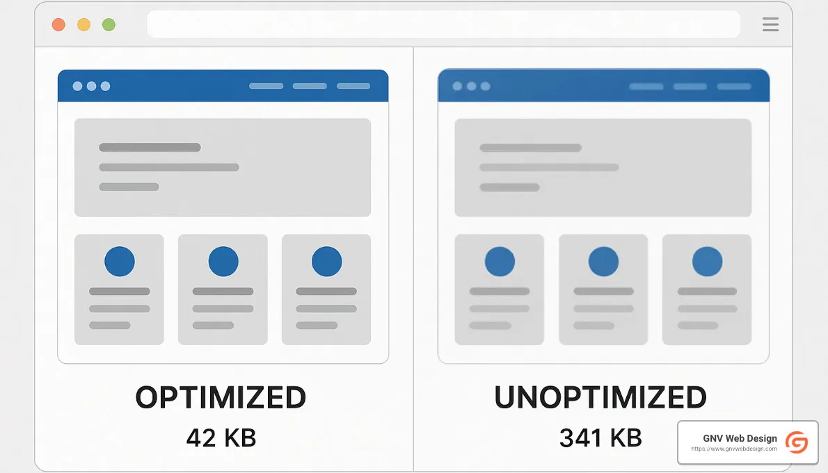
Image Optimization in SEO-Friendly Web Design
Images brighten up your website, making it visually appealing. But if you're not careful, they can also slow your page down. Optimizing images means choosing clear, descriptive file names, adding helpful alt tags to improve accessibility, and compressing images to reduce file size without losing quality.
Also, consider using WebP format for images, since it's smaller and lighter than JPEG or PNG—perfect for faster loading times!
Accessibility and User Experience
Good web design makes sure your site is accessible to everyone—including people with visual or hearing impairments. Accessibility is not only about doing the right thing, but it also helps your overall SEO.
Use clear and descriptive alt text for images, select high-contrast colors, and stick to legible fonts. Adhering to web accessibility guidelines makes your site welcoming for all visitors, improving satisfaction and engagement.
Indexability and Crawlability
Google needs to easily crawl and index your site to decide if it's worth ranking. Simple tools like robots.txt files and XML sitemaps clearly guide Google to the pages you want indexed.
Avoiding duplicate content is crucial, too—use canonical tags to clearly tell Google which page you want to prioritize. These steps ensure your content gets finded and ranks well.
By thoughtfully addressing these key elements—website speed, mobile responsiveness, site architecture, navigation and internal links, optimized content and images, accessibility, and crawlability—you'll create an SEO-friendly web design that drives organic traffic, delights users, and helps your business grow.
Best Practices for Implementing SEO-Friendly Web Design
When it comes to creating an SEO-friendly web design, getting it right from the start is far easier than trying to fix things later (trust me, you'll thank yourself!). The goal is to lay a strong foundation from the very beginning, combining the magic of stunning visuals with the practical know-how of SEO.
Collaboration is your best friend here. Designers and SEO experts working hand-in-hand can seamlessly blend creativity and technical savvy. Rather than viewing SEO as an afterthought, getting your SEO team involved early ensures key elements aren't missed and saves you headaches down the road.
Think of it as baking cookies—it's much easier to add chocolate chips to the dough than shoving them in after the cookies come out of the oven! So, integrate schema markup into the initial web development process. Schema markup helps search engines better understand your content, giving your pages a competitive edge in search results.
Continuous monitoring is another critical ingredient. Once your beautiful, optimized site goes live, the journey isn't over—actually, it's just begun! Regular analytics checks and performance tracking help you pinpoint what's working and identify areas for improvement. Keeping a close eye allows you to quickly adapt to algorithm changes (because Google loves keeping us on our toes).
Updates are essential. Search engines appreciate websites that stay fresh and relevant. Regularly refreshing your content, managing your internal links, and optimizing images keeps you ahead of the SEO curve. And if keeping track of all these details feels overwhelming, don't worry—that's exactly what experts like GNV Web Design are here for.
To make things simpler, here's a handy visual checklist to keep your SEO-friendly web design on track:

Check out our guide on Custom Web Development to Boost SEO for even more insider tips.
Common Mistakes to Avoid
When creating an SEO-friendly web design, many businesses put effort into getting it right—but sometimes, knowing what not to do can save you even more trouble. Let's look at some common pitfalls you'll want to avoid to keep your website performing at its best.
One of the biggest mistakes is neglecting site navigation. A confusing or overly complicated menu structure can frustrate your visitors, making them leave your site quickly—and search engines don't like that either. Your navigation should always be clear, logical, and user-friendly.
Another major misstep is ignoring page speed and performance. Slow-loading pages aren't just annoying—they actively hurt your rankings. Your visitors won't wait around if your site takes forever to load; they'll simply move on to a faster competitor. (Ouch!)
Similarly, overlooking mobile optimization is a huge no-no nowadays. With so many searches happening on smartphones and tablets, designing only for desktop is like leaving money on the table. Make sure your site is fully responsive and looks fantastic on all devices.
Image optimization is another area that's frequently neglected. Forgetting to include descriptive file names or alt tags means missing out on valuable SEO opportunities. Plus, oversized or uncompressed images slow down your pages significantly. Double-check that every image is optimized properly to keep things running smoothly.
Improper use of heading tags can also damage your SEO efforts. Headings should be structured logically (H1, then H2, then H3...), clearly signaling content hierarchy to both readers and search engines. Don't randomly toss them around just to make text bigger or smaller—always stay organized.
To make things easy, here's a simple table illustrating good versus bad practices:
| Good Practices | Bad Practices |
|---|---|
| Fast loading times | Slow page speeds |
| Mobile responsiveness | Desktop-only design |
| Descriptive alt tags | Missing alt tags |
| Proper heading hierarchy | Random heading usage |
Avoiding these common mistakes will put you on the right path towards an engaging, user-friendly, and search-engine-approved website. Thoughtful design combined with smart SEO practices will always set you up for success!
Frequently Asked Questions about SEO-Friendly Web Design
What is the difference between web design and SEO?
Web design is all about crafting the look and feel of your website—including layout, colors, typography, and user interactions. It's focused primarily on making your website visually appealing and easy to use.
On the other hand, SEO (Search Engine Optimization) is all about ensuring search engines like Google can easily find, read, and rank your website. It involves optimizing your content, code, images, and website structure so your target audience can find your site through search.
Think of web design as decorating your house for visitors, while SEO is putting clear signs on the road so visitors know exactly where to find you. When both come together in SEO-friendly web design, your website looks fantastic and gets seen by more people.
How does mobile-first indexing affect SEO?
Mobile-first indexing means that Google primarily looks at the mobile version of your website to decide how it ranks your pages. With most online searches now happening on mobile devices, Google wants to ensure users have a great experience, no matter which device they're using.
This makes having a mobile-friendly website more important than ever. If your site isn't optimized for mobile, you'll likely see your rankings drop, and fewer people will find you online.
To avoid this, make sure your website uses responsive design so it automatically adjusts to fit any screen size. Also, regularly check on mobile load times and usability to keep visitors (and Google) happy.
How do I optimize my images for SEO?
Optimizing images isn't complicated, but it's often overlooked. Here's a quick guide to getting it right:
Start by using descriptive file names for your images. Avoid generic names like "IMG1234.jpg"—instead, describe what's in the picture (for example, "blue-running-shoes.jpg"). This helps search engines understand your content better.
Next, reduce your image file sizes by compressing them (tools like TinyPNG or Squoosh make this easy). Smaller images load faster, improving your site's website speed and performance.
Always use alt tags (alternative text) to describe each image. Not only does this help visually impaired users steer your site, but it also gives search engines more context about your content.
Lastly, consider using modern formats like WebP, which can make your images significantly lighter without sacrificing quality.
By following these steps, your images will improve (not hurt!) your site's SEO.
If you're curious about how GNV Web Design can help you create an SEO-friendly web design that ranks well and looks great, reach out—we're here to help!
Conclusion
Your online presence is far too important to leave to chance. By investing in SEO-friendly web design, you're taking the crucial step of merging great looks with powerful functionality. After all, as we've explored, a stunning website won't mean much if your audience can't find it in the first place.
By thoughtfully combining design and SEO best practices, you create a site that not only impresses visitors but also ranks high on search engines. Whether it's optimizing your website speed, making your pages responsive to mobile users, or ensuring your content is both engaging and search-friendly, every step counts toward online success.
Now, we know web design and SEO may seem daunting at first. The good news is, you don't have to tackle this alone. Partnering with experienced pros, like our friendly team here at GNV Web Design, can ensure you're hitting all the right SEO notes. We specialize in custom web development that's fully optimized for search engines—and we make the process pretty painless (even enjoyable!).
Plus, we offer comprehensive support to all our clients, including unlimited edits (yes, you read that right) and impressively fast response times. Based right here in sunny Gainesville, Florida, we understand the local market but also have the experience to cater to businesses across a wide range of industries.
Ready to take your website to the next level? Visit the GNV Web Design Services page to see how we can help your business shine online.
Conclusion
Recap of importance of SEO-friendly web design; integrating design and SEO for success; partnering with experts like GNV Web Design; More info about services