 352-639-5270


Discover why mobile-friendly site design matters in today’s digital landscape—from responsive design to touch-friendly interfaces and optimized media. Learn key strategies to boost usability and SEO.
Why Mobile-Friendly Site Design Matters Now More Than Ever
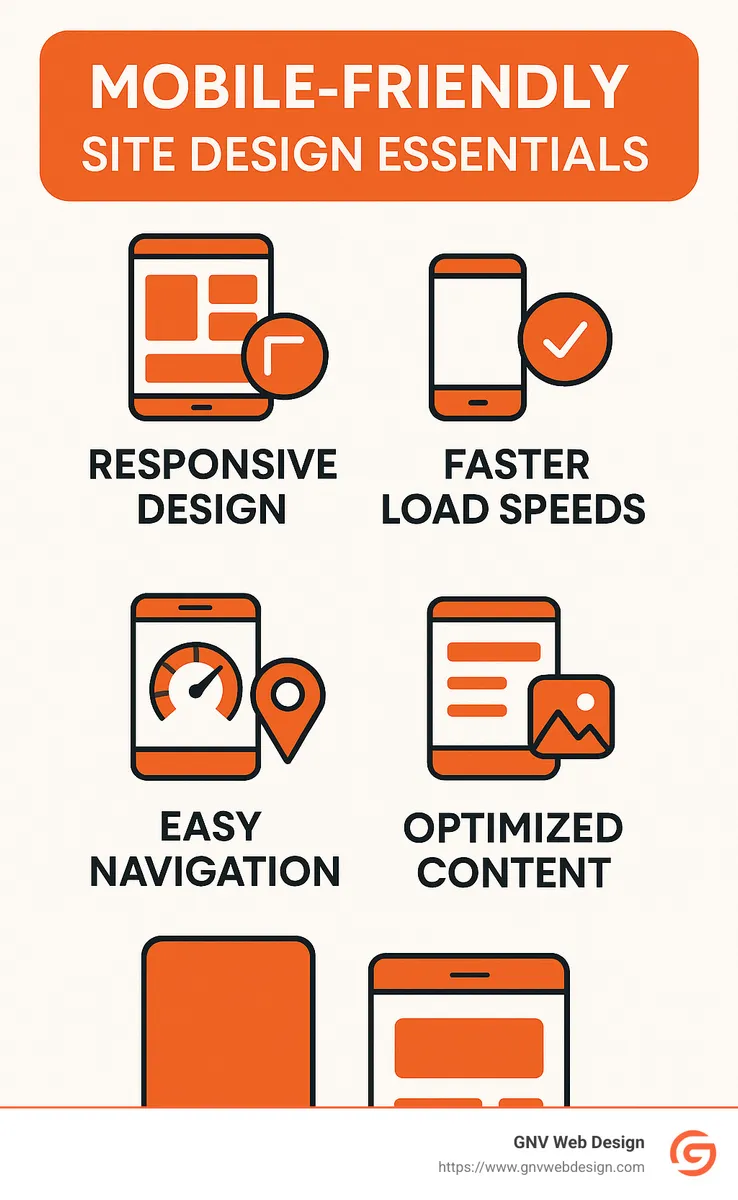
1. Accept Responsive Design for Optimal Mobile-Friendly Site Design
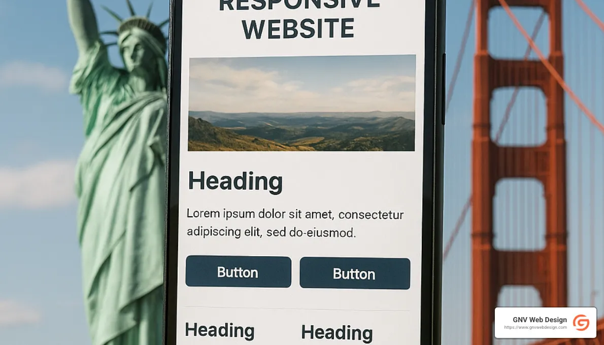
If there's one thing that's truly non-negotiable when it comes to mobile-friendly site design, it's responsive design. Think of responsive design as your website's built-in flexibility. Instead of creating separate websites for desktop, tablet, and smartphone users, responsive design lets your one-and-only site adapt gracefully and automatically to any screen size.
How does it work behind the scenes? Responsive design uses fluid layouts and smart CSS media queries to detect the screen size and optimize the layout accordingly. It’s like having a magical shape-shifting website, only less magical and more practical.

Google has made it crystal clear: they strongly recommend responsive design. Why? Because it's simpler to manage, easier to maintain, and provides a consistently great experience for all users—no matter what device they're on. (Trust us, keeping Google happy is always a smart move.)
At GNV Web Design, we've personally seen the powerful impact responsive design can have. One of our Gainesville clients, a popular local restaurant, made the switch and saw their mobile bounce rate plummet by 35%. Suddenly their menus and online ordering system were easy to steer on smartphones, and their customers loved it.
But responsive design isn't just about looking pretty. It's about real usability. When designed properly, your site will automatically adjust so that text remains clearly readable—without any frustrating pinch-to-zoom action. Buttons and links will stay easily tappable, even for large thumbs. Images will scale neatly without losing quality. And users won't have to scroll side-to-side or struggle with tiny forms on small screens.
From a development standpoint, responsive design relies on relative units (like percentages or viewport units) instead of fixed pixel measurements. It also uses flexible grid layouts and defines key breakpoints where the layout should reshuffle.
Curious to know more about how responsive design can boost your site's performance (and your business)? Check out our in-depth article on responsive web design services.
2. Prioritize Page Speed for Improved User Experience
When it comes to mobile-friendly site design, speed isn't just nice to have—it's absolutely crucial. Think about it: how many times have you clicked on a site and bounced away because it took forever to load? (We've all been there!)
Mobile users, especially, often have spotty connections or are simply impatient. In fact, did you know that 47% of visitors leave a website if it takes more than 2 seconds to load? Yup—just two seconds, and you've potentially lost half your visitors!
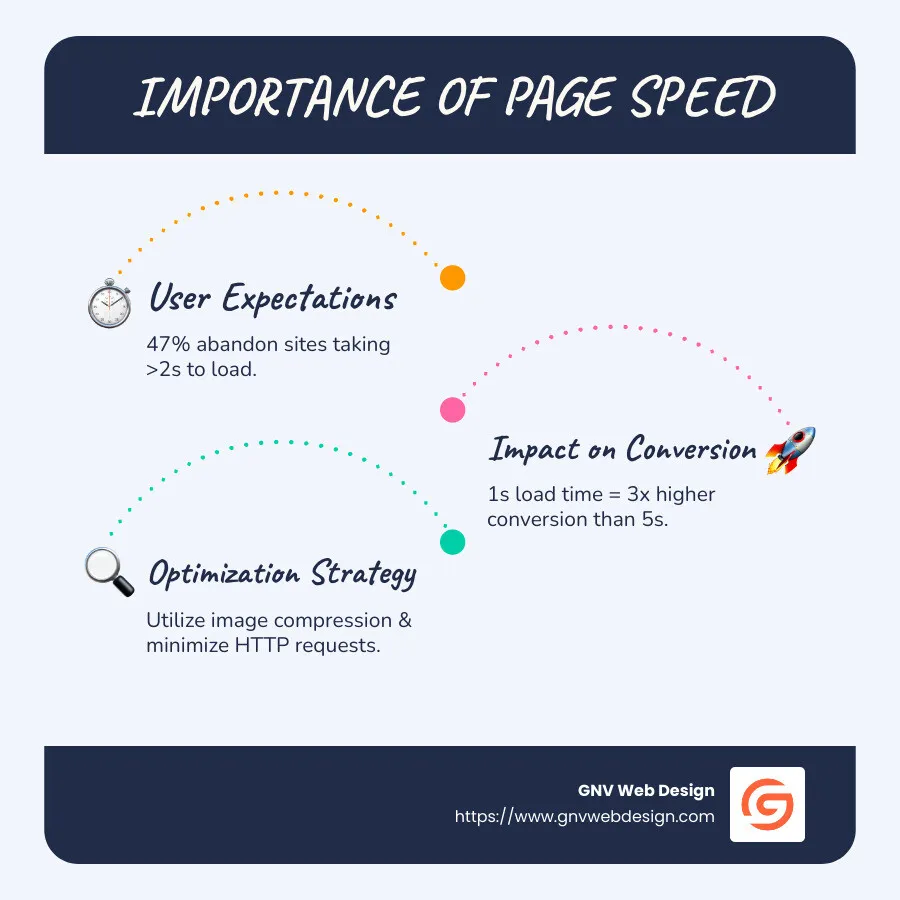
And here's another eye-opener: "A website that loads in one second has a conversion rate three times higher than a site that loads in five seconds." Talk about a clear incentive to speed things up!
At GNV Web Design, we take page speed seriously. We've seen how focusing on speed can transform our clients' businesses. For a recent client in Jacksonville, speeding up their page load led to a 40% improvement in user retention—just by optimizing images!
Speaking of image optimization: images are usually the biggest culprits slowing down websites. To speed things up, we compress images, resize them properly, and use newer formats like WebP whenever possible. This keeps your visuals sharp without the extra bloat.
But images aren't the only troublemakers. We also look closely at how many HTTP requests your site is making. Every little element—like images, CSS, and JavaScript—creates an individual request, adding to the loading time. By consolidating files and removing unnecessary elements, we significantly reduce load times.
Another trick in our toolbox is enabling browser caching. This means repeat visitors won't have to download the same resources over and over again, providing fast load times on repeat visits. (Who doesn't appreciate a little familiarity and speed?)
And of course, behind every speedy site is a reliable server. At GNV Web Design, we partner with premium hosting providers to keep server response times under 200 milliseconds. Think of it like your website having a powerful engine revving below the surface.
We also optimize CSS and JavaScript by minifying and combining files. Loading these resources asynchronously (fancy tech-talk meaning they don't block your content from showing up) ensures your visitors see and interact with your pages faster.
When we applied all these optimizations for one of our clients in Tampa, their Google PageSpeed score jumped from 65 to an impressive 92 on mobile devices. And not surprisingly, this boosted both their user experience and SEO rankings. Google now uses page speed as a key ranking factor for mobile searches, meaning a slow site isn't just bad for users—it's also hurting your chances of being found online.
Bottom line: Fast-loading pages equal happier visitors. Happier visitors equal more conversions. It's really as simple as that.
Want to dive deeper into how great SEO and thoughtful design work hand-in-hand? Check out our detailed post on crafting websites that rank.
3. Simplify Navigation for Mobile Users
When designing for mobile, navigation presents a unique challenge. The expansive menus that work well on desktop can become unwieldy nightmares on smaller screens. Effective mobile-friendly site design requires rethinking how users move through your site.
The Hamburger Menu Revolution
The hamburger menu (those three horizontal lines that expand to reveal navigation options) has become ubiquitous in mobile design for good reason—it saves valuable screen real estate while keeping navigation accessible.

A client of ours in Tallahassee initially resisted implementing a hamburger menu, preferring to keep their full navigation visible. After making the switch, they saw average session duration increase by 1.5 minutes as users found it easier to steer to the content they wanted.
Keep It Simple and Strategic
Research shows that mobile users prefer simpler navigation structures. Here's how we approach mobile navigation:
- Limit primary navigation to 5-7 items maximum
- Place the most important items first or last (users remember these positions best)
- Use clear, concise labels that make sense without context
- Implement a "Back to Top" button for long scrolling pages
- Ensure the logo links back to the homepage (a standard user expectation)
Design for Thumbs
Understanding how people physically hold and interact with mobile devices is crucial. Most users steer with their thumbs, and certain areas of the screen are easier to reach than others.
We design mobile navigation with "thumb zones" in mind:
- Easy-to-reach areas for primary actions
- Harder-to-reach corners for less frequent actions
- Adequate spacing between clickable elements (minimum 10mm × 10mm)
As one designer aptly put it, "Large buttons are great for large thumbs! 👍"
Secondary Navigation Options
Beyond the primary menu, we implement additional navigation aids:
- Sticky headers that remain visible while scrolling
- Search functionality prominently displayed
- Quick action bars for frequently used features
- Breadcrumbs for complex sites with deep hierarchies
For an Ocala-based e-commerce client, implementing these navigation principles resulted in a 22% increase in pages per session and a 15% decrease in their cart abandonment rate.
More info about user-centric design
4. Optimize Media for Mobile Devices
Quality media like images and videos can really bring your website to life. But only if they load quickly! Large files can seriously slow down your mobile site, frustrating visitors and hurting your search rankings. That's why optimizing media is a must-have for your Mobile-friendly site design.
Let's explore how you can keep your visuals stunning without sacrificing performance on mobile.
Image Optimization Techniques
Images typically make up the biggest chunk of a webpage's size, especially on visual-heavy websites. Here at GNV Web Design, we've developed a few tried-and-true techniques to ensure our clients' sites load lightning-fast on smartphones and tablets.
First, we always use properly sized images, resizing them precisely to their display dimensions. There's no reason to use a huge image if it'll only show up small, right?
Next, we use compression tools to shrink image file sizes without losing noticeable quality. The result? Smaller files that load faster, boosting your site's speed and user experience.
We also accept next-generation image formats like WebP, JPEG 2000, or AVIF whenever possible. These newer formats offer better compression than older JPEGs and PNGs, meaning even smaller file sizes at the same visual quality.
Another neat trick is responsive images. By using the srcset attribute, we serve different-sized images to different devices based on their screen size and resolution. That way, mobile users won't download images designed for desktop-sized screens.
Finally, we use lazy loading for images further down the page. This technique loads images only as users scroll down to them, so your initial page load stays fast and snappy.
Just ask one of our Florida tourism clients! By optimizing their images using these methods, we cut their homepage load time by over 3 seconds—leading directly to a 17% increase in mobile bookings. Not too shabby, right?
Video Optimization for Mobile
Videos are fantastic ways to engage visitors, but they can also put a serious drag on your mobile loading speeds. Thankfully, we've got some smart strategies for video optimization too.
We typically avoid autoplay videos on mobile, as they can slow down your site and consume more data (not to mention annoy your visitors!). Instead, we prefer showing a lightweight thumbnail image that loads the video player only when clicked.
Hosting videos externally—like on YouTube or Vimeo—is another great way to save bandwidth and keep your pages lightweight. These platforms handle the heavy lifting so your server can breathe easy.
Of course, we exclusively use HTML5 video, since Flash is now completely outdated and unsupported on almost all mobile devices. For the best possible playback quality, we also implement adaptive bitrate streaming whenever possible, automatically adjusting video resolution based on your visitors' connection speeds.
Eliminating Flash Completely
Speaking of Flash—it's time to say goodbye forever. Adobe Flash doesn't work at all on iOS devices and is unsupported on most modern Android browsers. If your website still uses Flash, replacing it ASAP with HTML5, CSS3, and JavaScript alternatives is essential to ensure a great mobile experience.
Testing Media Performance
Optimizing media isn't a "set it and forget it" situation—we regularly test performance on real devices and slower connections to keep everything running smoothly. Google's PageSpeed Insights tool helps us pinpoint exactly which media elements might slow things down, so we can quickly fix any issues.
Curious how your site stacks up? Try Google's free Mobile-Friendly Test tool to see if your website's media and overall design pass the test:
Test your site's mobile friendliness
Optimizing media can make a massive difference in user experience, conversions, and SEO rankings. At GNV Web Design, we've seen how these simple yet powerful optimization tactics drive real results for our clients.
So don't let oversized media slow down your mobile site—we're here to help your visuals shine brightly without hogging bandwidth!
5. Craft Touch-Friendly Interface Elements in Your Mobile-Friendly Site Design
Have you ever struggled to tap a tiny link with your thumb, only to end up visiting the wrong page? We've all been there—it's frustrating! That's why effective Mobile-friendly site design means thinking carefully about how fingers and thumbs interact with your website. Unlike clicking precisely with a mouse, tapping on mobile requires larger, finger-friendly elements.
The Science of Touch Targets
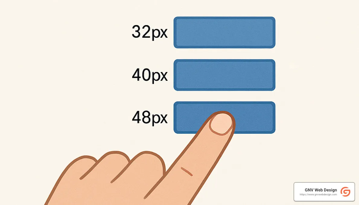
Believe it or not, there's an actual science behind designing touch-friendly websites. According to research from MIT's Touch Lab, the average adult fingertip measures between 10-14mm, and thumbs are typically even larger. To accommodate this, Google recommends touch targets of at least 48 × 48 CSS pixels, while Apple suggests a minimum of 44 × 44 points. At GNV Web Design, we usually aim even bigger—around 60 × 60 pixels for main interactive buttons—to ensure they're easy and comfortable for everyone to tap.
Here's a helpful visual to illustrate optimal button sizing for mobile interfaces:
Spacing Matters as Much as Size
Size alone won't fix all your tapping troubles. Ever tried pressing a link only to accidentally hit the one beside it? To avoid these "fat finger" mishaps, touch targets must have adequate space around them. We make sure to leave at least 8-10 pixels of clear space between interactive elements.
Our clients have seen how these spacing improvements can boost business. One Jacksonville event-ticketing client experienced a 23% drop in user errors and a 17% increase in mobile ticket sales simply by optimizing button spacing on their checkout process.
Strategic Placement of Interactive Elements
Think about how you hold your smartphone—most of us rely mainly on our thumbs, right? This practical insight guides us as we plan where to position interactive elements. We place primary buttons and important links within easy thumb reach, usually toward the center or bottom of the screen. Less critical features go higher up, and we steer clear of placing vital buttons in far corners—those spots are trickier to tap comfortably.
When appropriate, we also love using swipe gestures. They feel natural and keep things interactive without cluttering your screen.
Form Fields Designed for Touch
Let's face it—filling out forms on mobile can be a real headache. To create stress-free forms, we make input fields full width whenever possible. We choose input types carefully (number, email, date, etc.) to trigger correct mobile keyboards automatically.
We also make checkboxes and radio buttons larger and easier to tap. Dropdown menus on mobile are often awkward, so we try to use them sparingly and only when necessary. Clear visual feedback when tapping fields helps users know exactly where they are, so they don't lose their place.
Visual Feedback for Touch Interactions
Speaking of visual feedback, good design tells users clearly when their taps register successfully. This simple confirmation builds trust and confidence on your site. When users tap buttons, we show immediate visual changes, like subtle color shifts or animations, to signal that an action is in progress.
Once the action is completed, we provide clear confirmation, letting users know their request was successful. A little visual reassurance goes a long way toward building trust with your audience.
Testing Across Devices
Ever tap a button and wonder if anything happened? That's exactly what we want to avoid. Clear visual feedback reassures users their taps registered. We implement subtle animations, color changes, or loading indicators to signal that something is happening behind the scenes.
Once the action is completed, we provide clear confirmation, letting users know their request was successful. A little visual reassurance goes a long way toward building trust with your audience.
We've helped businesses from Jacksonville to Tallahassee fine-tune their mobile CTAs, driving real results and boosting their bottom line. Effective mobile CTAs aren't just about design—they're about understanding how real people use real devices, and creating seamless, frustration-free interactions that bring those users one step closer to becoming customers.
6. Ensure Readable and Accessible Content
When it comes to mobile-friendly site design, content readability isn't just nice-to-have—it's crucial. Mobile users are often on-the-go, navigating small screens and challenging lighting conditions (hello, Florida sunshine!), meaning your content needs to be clear, comfortable, and easy to skim.
Typography That Works on Small Screens
Choosing the right font size and style for mobile devices can dramatically improve readability. At GNV Web Design, we live by the motto: "Go big or go home." That's why we recommend a font size of at least 16px for body text. Smaller than that, and users start squinting or zooming—neither of which is ideal.
Font style matters, too. Sans-serif fonts (think Arial or Roboto) are clean, simple, and easy to read on small screens. We also pay attention to the spacing between lines (known as line-height). Slightly increased line spacing, typically 1.4 to 1.5, makes content easier on the eyes, especially when scrolling quickly or reading outdoors.
And let's not forget contrast. To keep mobile content clear and accessible, we ensure there's a high contrast between text and background colors, aiming for at least a 4.5:1 contrast ratio. It makes a huge difference—especially on bright, sunny days.
One of our financial clients in Tampa saw a 40% increase in average reading time after we boosted their font size and improved their color contrast. Yep, readability really does matter.
Content Chunking for Mobile Consumption
Have you ever felt overwhelmed by a massive wall of text on your phone? You're not alone. Mobile users skim—they don't dive deep into long paragraphs. That's why we organize content into short, scannable sections. We limit paragraphs to around 3-4 lines each and add clear subheadings regularly to break things up.
We don't shy away from using bullet points or numbered lists when appropriate, and we strategically highlight key information by using bold text. The result? Content that's easy to digest even when users are on-the-go.
White Space as a Readability Tool
Adding white space isn't wasting space—it's a smart design move. Generous margins around text blocks, spacing between paragraphs and sections, and plenty of breathing room around images create a comfortable reading experience for mobile users.
We carefully balance negative space so users don't feel overwhelmed, guiding them smoothly through your content without strain or confusion.
Accessibility Beyond Readability
True mobile-friendly site design doesn't just mean making your site readable, it also means making it accessible to everyone—including users with disabilities. At GNV Web Design, we follow accessibility best practices by structuring pages clearly for screen readers, providing descriptive alt text for images, and making sure interactive elements work with keyboard navigation.
We also ensure color isn't the only way important information is conveyed, since some users have color blindness or vision difficulties. Plus, we test to make sure our content remains readable when resized up to 200% without breaking the design.
A government client we worked with here in Florida saw a 32% boost in mobile engagement after implementing these accessibility improvements. That's the beauty of accessibility—it benefits everyone.
Content Prioritization
Mobile users often have different priorities than those on desktop. Think about someone quickly checking your site from their smartphone—they probably want critical info (like hours, location, or contact details) right away.
That's why we carefully analyze user behavior to prioritize mobile content, placing the most important information right at the top. Critical calls-to-action are always visible without scrolling. Secondary buttons are placed naturally within the flow of the user's journey, so they feel intuitive rather than intrusive.
7. Avoid Intrusive Pop-ups and Interstitials
Pop-ups and interstitials can be effective marketing tools on desktop sites, but they often become conversion killers in mobile-friendly site design. On smaller screens, these elements can completely obstruct content, frustrating users and potentially hurting your search rankings.
Google's Stance on Intrusive Interstitials
Google has taken a clear position on this issue. Since 2017, their mobile-friendly algorithm has penalized sites that show intrusive interstitials to mobile users. As Google states: "Pages that show intrusive interstitials provide a poorer experience to users than other pages where content is immediately accessible."
Types of interstitials that Google specifically calls out as problematic:
- Pop-ups that cover the main content immediately or while browsing
- Standalone interstitials that must be dismissed before accessing content
- Layouts where the above-the-fold portion resembles a standalone interstitial
Acceptable Alternatives
Not all pop-ups are problematic. Google acknowledges that certain types are necessary:
- Legal obligations (cookie notices, age verification)
- Login dialogs for content that isn't publicly indexable
- Reasonably sized banners that use minimal screen space
For a retail client in Ocala, we replaced their full-screen mobile newsletter signup with a small, dismissible banner at the bottom of the screen. This change not only improved their mobile search rankings but increased newsletter signups by 12% as users were less annoyed by the experience.
Strategic Implementation of Mobile Messaging
If you must use pop-ups or similar elements on mobile, here's how we recommend implementing them:
- Timing matters: Delay pop-ups until users have engaged with your content
- Size appropriately: Ensure they don't take over the entire screen
- Make dismissal obvious and easy: Large, clear close buttons that are easy to tap
- Target intelligently: Show pop-ups based on user behavior, not just page load
- Consider exit-intent on desktop only: Save aggressive pop-ups for desktop users
Alternatives to Traditional Pop-ups
We often recommend these mobile-friendly alternatives:
- Inline calls-to-action embedded within content
- Slide-in elements that don't obscure the main content
- Sticky headers or footers with important messaging
- Tab-based interfaces that users can expand when interested
A client in Jacksonville saw a 28% reduction in mobile bounce rate after replacing their aggressive pop-up with a subtle slide-in element that appeared after users had scrolled through 50% of the content.
The goal is to improve the user experience, not interrupt it. As we like to tell our clients at GNV Web Design: "If your content is compelling enough, you won't need to trap users with pop-ups to get their attention."
8. Implement Effective Call-to-Action (CTA) Buttons
Your call-to-action (CTA) buttons are the superheroes of your website—they turn casual visitors into engaged customers. But creating effective CTAs for mobile-friendly site design requires special attention. What looks great and works well on a desktop can quickly become frustrating and hard to use on smaller, touch-driven screens.
Size and Tappability
Let's face it—we've all fumbled to tap tiny buttons on our phones. Designing CTA buttons that are easy to tap is essential. Apple recommends a minimum size of 44×44 pixels for mobile buttons, but at GNV Web Design, we like to go even bigger—around 60×60 pixels—to accommodate thumbs big and small.
It's also important to include plenty of padding around your button text. This increases the tappable area, helping users hit their target on the first try.
For example, one of our real estate clients in Tampa saw a 23% increase in mobile leads simply by enlarging their "Schedule Viewing" button just slightly—proof that when it comes to mobile CTAs, bigger really is better!

Contrast and Visual Prominence
On mobile screens, your CTA buttons need to stand out clearly, even when viewed under bright sunlight or less-than-ideal conditions. We achieve this by choosing bold, contrasting colors that pop against the background.
Important actions get extra visual emphasis—think brighter colors, larger buttons, and strategic positioning. We also ensure there's enough white space around buttons to make them visually distinct and easily identifiable at a glance.
Clear, Action-Oriented Text
Great buttons tell users exactly what they'll get with a tap. Instead of vague terms like "Submit," we use clear, action-focused language like "Get Your Free Quote" or "Book Your Appointment." Short and sweet (ideally 2-4 words) is the goal here.
We also make sure the text on mobile buttons is comfortably readable—16px or larger—to avoid squinting and eye strain. Clarity is king for mobile conversions!
Strategic Placement
Location, location, location. It's just as true for CTA buttons as it is for real estate. Think about how users hold and interact with their phones. Buttons placed within easy thumb reach—usually toward the middle or lower part of the screen—perform best.
We also make sure critical CTAs appear "above the fold" (visible without scrolling) to capture attention immediately. Secondary buttons are placed naturally within the flow of the user's journey, so they feel intuitive rather than intrusive.
A Gainesville-based restaurant client experienced a 34% increase in mobile orders simply by moving their "Order Now" button from the top right corner to a thumb-friendly position at the bottom. Small changes can have huge impacts!
Visual Feedback
Ever tap a button and wonder if anything happened? That's exactly what we want to avoid. Clear visual feedback reassures users their taps registered. We implement subtle animations, color changes, or loading indicators to signal that something is happening behind the scenes.
Once the action is completed, we provide clear confirmation, letting users know their request was successful. A little visual reassurance goes a long way toward building trust with your audience.
Testing Across Devices
Finally, designing effective CTA buttons means testing, testing—and more testing. At GNV Web Design, we always test across multiple real devices, screen sizes, operating systems (Android and iOS), and different network speeds. This ensures your buttons look great and perform flawlessly, no matter how your visitors access your site.
We've helped businesses from Jacksonville to Tallahassee fine-tune their mobile CTAs, driving real results and boosting their bottom line. Effective mobile CTAs aren't just about design—they're about understanding how real people use real devices, and creating seamless, frustration-free interactions that bring those users one step closer to becoming customers.
9. Test and Optimize Using Real Devices
Creating a truly effective Mobile-friendly site design involves more than just theory and simulation—after all, real people don't browse your website on emulators. They use actual phones and tablets, tapping screens, swiping pages, and navigating menus in ways that can't always be replicated by software.
At GNV Web Design, we believe in rigorous testing on real mobile devices. Why? Because the mobile experience varies greatly between different brands, screen sizes, and operating systems. A website that works perfectly on an iPhone might not behave the same way on an Android device.
The Limitations of Emulators
Emulators and browser tools are great for quick checks during development. But they miss crucial details that can make or break the user experience. Touch interactions feel different on real screens, and scrolling speeds or animations might feel clunky or unnatural on actual devices.
Real phones also differ significantly in performance and display quality. Brightness, contrast, and color accuracy vary widely between models. Even network conditions—ranging from blazing fast Wi-Fi to slower 3G connections—can drastically affect how quickly your site loads and how smoothly it runs.
Our Multi-Device Testing Approach
At GNV Web Design, we've built a thorough testing process to ensure your Mobile-friendly site design delivers a great user experience across the board.
We test on multiple iOS and Android phones, covering the most popular screen sizes and device brands. We also pay careful attention to differences between operating systems and browsers, ensuring consistent performance whether your visitor uses Chrome, Safari, or even something less common like Firefox Mobile.
Our testing isn't limited to one orientation either—we check both portrait and landscape modes, ensuring your content adapts smoothly when screens rotate. And because real-world users aren't always blessed with perfect connectivity, we simulate various speeds, from blazing fast 5G down to slower connections, to ensure your site stays responsive even under less-than-ideal conditions.
These methods have helped us uncover real user-experience issues others have missed. For example, one of our Jacksonville-based healthcare clients had a critical booking form issue that only appeared on certain Android devices. Catching this early meant happier patients and fewer headaches down the road.
User Testing on Real Devices
Technical checks are essential, but we also go a step further by conducting user testing sessions on actual mobile devices. Watching real users steer your website helps us spot problems that might not show up in standard tests.
For instance, one of our Tallahassee clients had a checkout form that was technically functioning—but through user testing, we finded people got confused by the placement of form fields on smaller screens. Adjusting the layout improved usability and reduced customer frustration significantly.
We often say, "You won't know how users truly feel until you watch them use your site."
Ongoing Optimization
Mobile design isn't a "set it and forget it" matter. As new phones hit the market and operating systems evolve, your website needs regular testing and updates to remain competitive.
We use A/B testing to fine-tune layouts, headlines, and calls-to-action over time, continuously improving your site's performance. Regular performance monitoring helps us adapt to changing user expectations, ensuring your customers always get the best mobile experience possible.
Tools We Use for Comprehensive Testing
While real device testing is irreplaceable, we also leverage advanced tools to supplement our approach.
BrowserStack allows us to quickly test countless device-browser combinations, ensuring compatibility. Google's Mobile-Friendly Test provides a quick baseline assessment of your site's mobile readiness. PageSpeed Insights helps us identify performance bottlenecks, and Chrome DevTools makes debugging and performance profiling a breeze.
To learn more about mobile optimization guidelines directly from Google, check out their handy guide: Google’s mobile-first indexing best practices.
At GNV Web Design, we know that rigorous testing and consistent optimization are key to creating outstanding mobile experiences. After all, your website is your 24/7 salesperson—it deserves every advantage possible!
10. Leverage Mobile-Specific Features
A truly outstanding Mobile-friendly site design doesn't stop at just adapting to smaller screens—it actively accepts the unique capabilities that mobile devices offer. By making smart use of mobile-specific features, you create a richer, smoother, and more delightful experience for your users.
Let's explore some of the most powerful ways you can leverage these mobile-exclusive features to boost engagement, conversions, and customer satisfaction.
Geolocation Integration
One standout feature of mobile devices is their built-in GPS. Location awareness can transform your mobile website experience from "just okay" to "wow, that's convenient!"
For example, a multi-location business across Florida can use geolocation to show users their closest store or office immediately. Adding handy maps and directions helps visitors quickly get where they need to go—no more typing tedious addresses.
Our client based in Gainesville leveraged geolocation for their mobile-friendly site. The result? A 32% increase in in-store visits from mobile users. Now that's a win-win!
Click-to-Call Functionality
Let's not forget one obvious fact: smartphones were originally made for calling! Incorporating click-to-call buttons is a no-brainer, making it easy for your visitors to quickly connect with your business.
Strategically placed tap-to-call buttons throughout your site, especially at decision-making points, can dramatically boost conversions. One of our Gainesville-based service industry clients saw inbound calls jump by 45% after we positioned clear and friendly click-to-call buttons across their website.
Mobile Payment Options
Mobile payment methods like Apple Pay, Google Pay, and other digital wallets are rapidly entering the mainstream. By integrating these payment options, you simplify your checkout process and make it easier for visitors to complete transactions on-the-go.
Allowing returning customers to save payment information or offering QR code payments can also speed things up significantly. Your users—and your conversion rates—will thank you.
Device Sensors and Capabilities
Today's mobile devices are packed with advanced sensors and capabilities. Why not use them to improve your visitors' experience? Features like camera access let users scan QR codes for instant information. Or use the accelerometer to create playful interactions.
You can even add subtle haptic (vibration) feedback to give tactile confirmation when an action is completed. Biometric authentication (fingerprint or face ID) can also streamline secure logins and payments, providing convenience and reassurance for your users.
Progressive Web App Features
Progressive Web Apps (PWAs) blend the best of both worlds—websites and native apps. They offer offline access through service workers, push notifications for user re-engagement, and app-like navigation to boost usability.
One of our Tampa-area news website clients saw an impressive 73% increase in return visits after we helped them roll out PWA features. The result was happier users and significantly improved engagement metrics.
Mobile-First Content
Beyond just using neat device features, adapting your content for mobile is critical. Consider short-form, vertical videos custom for mobile viewing, or voice-activated search optimization for hands-free convenience.
Micro-interactions—those tiny moments of delight when users tap or swipe—can also make your mobile content feel more engaging and intuitive. Keeping your content short, punchy, and relevant to mobile use cases (like quickly checking info while on-the-go) ensures visitors have the best possible experience.
Cross-Device Continuity
People often switch between devices when exploring or shopping online. Making it easy for users to smoothly transition from mobile to desktop (and vice versa) can significantly boost your overall conversions.
Persistent shopping carts, "email this to myself" links, and account synchronization across devices can help users pick up exactly where they left off. When one of our Ocala-based clients implemented these cross-device features, they finded that 23% of their mobile users completed purchases later on desktop. That's revenue they would have missed otherwise!
Thoughtfully implementing these mobile-specific features isn't just good for users—it’s great for your business, too. Ready to build a truly exceptional Mobile-friendly site design with these powerful features?
More info about leading web design services
Frequently Asked Questions about Mobile-Friendly Site Design
What is Mobile-First Indexing and Why Does It Matter?
Mobile-first indexing is simply Google's new way of looking at your website. Instead of judging your site based on how it performs on a desktop, Google now primarily evaluates your mobile-friendly site design to decide where you rank in search results. This is a big deal—especially if you want customers to actually find you on Google.
Why the change? Well, since 2018 (fully rolled out by 2021), Google has seen more users searching on their mobile devices than on desktops. This shift made them realize the mobile version of your website should be the main version they use to rank your pages.
Here's why this matters: if your mobile website is missing important content that's available on your desktop version, Google might not even know it's there—and neither will your potential customers. Your mobile site isn't just an afterthought; it's now the star of the show.
Google puts it bluntly: "There will be 'no degrees of mobile friendliness' — your site will either be judged as mobile-friendly... or not." So, if your mobile site is slow, hard to steer, or incomplete, your entire site's search visibility could suffer.
For businesses in busy Florida markets like Tampa, Jacksonville, or right here in Gainesville, a poor mobile experience could mean your customers wind up clicking on a competitor's site instead of yours.
How Can I Improve My Website's Loading Speed on Mobile Devices?
Let's face it—nobody likes waiting, especially online. About 47% of visitors expect your site to load in just 2 seconds or less. So how can you speed things up and keep those visitors engaged?
First, optimize your images. This alone can drastically improve your speed. Tools like TinyPNG or ImageOptim compress images without losing quality. We also recommend resizing your images to exactly the dimensions they'll appear in, using modern formats like WebP, and implementing lazy loading—so images only load when users scroll to them.
Next, reduce what your page loads. Every file your site requests slows loading down. Combine your CSS and JavaScript files, cut out unneeded plugins and scripts, and use CSS sprites for multiple small images. Resource hints like preconnect and preload also speed things up.
Don't forget about browser caching. By setting up cache headers, your site tells browsers to store certain resources, speeding up future visits. Using a Content Delivery Network (CDN) and enabling service workers for Progressive Web Apps (PWAs) can also give your site a real performance boost.
Clean up your site's code too. Minify CSS, HTML, and JavaScript by removing unneeded spaces and comments. Eliminating render-blocking resources and using critical CSS techniques can help your site appear faster.
Finally, consider your site's server performance. Quality hosting providers, compression technologies (like GZIP or Brotli), and newer connection protocols (HTTP/2 or HTTP/3) can significantly decrease loading times.
At GNV Web Design, we recently helped a client in Tallahassee speed up their site from 5.2 seconds to a lightning-fast 1.8 seconds. Their bounce rate dropped by 28%, and conversions increased by 17%. Speed really does matter.
What Are the Key Differences Between Responsive, Adaptive, and Separate Mobile Sites?
Choosing the best mobile-friendly site design strategy starts with understanding your options: responsive, adaptive, and separate mobile websites.
Responsive design is Google's favorite (and ours too!). It uses CSS media queries that automatically adjust your site's layout based on screen size. The same HTML is sent to all devices, making it easier to maintain and providing a consistent user experience. Plus, having one URL for all devices is great for SEO. If you're looking for an easy-to-maintain, SEO-friendly solution, responsive design is typically your best bet.
Adaptive design is a bit different. Unlike responsive, adaptive uses several predefined layouts custom specifically to different devices. Your server detects whether visitors are using a phone, tablet, or desktop and sends them a specially designed layout. While this gives you more control, it can be more complicated to manage and maintain since you have multiple layouts to update.
Separate mobile sites mean exactly that—two completely different websites, usually with the mobile version hosted on a subdomain like "m.yoursite.com." While this approach gives you complete freedom to customize each site, it also doubles your work and can make SEO tricky. You'll have to juggle redirects, canonical tags, and two different content sets. It's usually more hassle than it's worth for most businesses.
Our recommendation? In almost all cases, responsive design is the clear winner. Google even states, "Responsive Web Design is the easiest pattern to implement and maintain." Unless you have very specific or complex needs—like legacy systems or very different mobile functionality—responsive is usually the best choice.
One of our Jacksonville clients previously had a separate mobile site and struggled with SEO and maintenance headaches. After switching to responsive design, their mobile organic traffic jumped by 34%, and they saved significantly on development costs.
Still unsure about your mobile-friendly site design? We're always here to help businesses across Gainesville and throughout Florida steer these important decisions.
Conclusion
Creating a mobile-friendly site design isn't about chasing tech trends or impressing designers—it's simply about meeting your customers where they already are. With mobile traffic now making up over 58% of all website visits, building a great experience for smartphone users isn't just helpful—it's essential.
Responsive design is your starting point, automatically adjusting your layout to look fantastic on any screen size. But being mobile-friendly doesn't stop there. Speed optimization is equally crucial—every second you shave off your load time boosts conversions (and prevents impatient thumbs from bouncing).
Simplifying navigation is also a must-do for mobile. Users shouldn't have to play hide-and-seek to find your menu items or get lost in endless scrolling. Clear, intuitive navigation makes it easy for visitors to find exactly what they're after, keeping frustration to a minimum.
Media optimization strikes the right balance between engaging visuals and fast performance. Your images and videos should capture attention without bogging down load times, ensuring your content shines without slowing everything to a crawl.
Don't forget the human side—your website is being used by real people with real fingers! Crafting touch-friendly interface elements, like generously sized buttons, adequate spacing, and thoughtful form design, makes your site a pleasure to use rather than a frustrating tap-dance exercise.
Readable, accessible content is equally non-negotiable. Small screens demand clear typography, easy-to-digest paragraphs, and high contrast. Nobody wants to squint at their phone—unless they're trying to decipher those tiny shampoo bottle directions (no thanks!).
And let's talk pop-ups—please don't trap your visitors behind intrusive interstitials. Google punishes this, and your users won't thank you either. Less interruption means happier visitors who stick around and engage with your content.
On mobile, your CTAs need to be more than clickable—they need to be downright irresistible. Effective, easy-to-tap buttons with action-oriented language and strategic placement guide your visitors effortlessly toward conversion.
Thorough testing on actual mobile devices is the best way to catch sneaky issues you might miss on desktop or emulators. Nothing beats real-world conditions to make sure your mobile site truly shines—and doesn't accidentally implode when someone opens it on their aging Android from 2015.
Finally, accept mobile-specific features that smartphones uniquely offer, like geolocation, click-to-call, mobile payment options, and even Progressive Web App capabilities. These create a customized, convenient experience your users just can't get on desktop.
Contact our team of mobile web design experts today—let's create a mobile experience your customers will love!